
This is a heading
A heading is a title that breaks your page into sections. Headings make content clearer to follow and are important for accessibility. Always use them in order, starting from Heading 2 under the main page title.
This is a sub-heading
A subheading is a smaller title under a main heading that helps organise information. Subheadings make content easier to read, guide the reader through sections, and improve understanding.
This is a H2 heading
This is a H3 heading
This is a H4 heading
This is a H5 heading
This is a H6 heading
Button
When to use buttons
Use buttons for key actions you want users to take, such as submitting a form, starting an application, or moving to the next step in a process. Buttons stand out clearly on the page and guide users toward completing important tasks.
When not to use buttons
Do not use buttons for every link on a page. If the action is minor, less important, or simply navigates to related information, use a text link instead. Overusing buttons can cause confusion, reduce their impact, and make it harder for users to know which action is most important.
Primary button Secondary button Secondary buttonCare Card
When to use care cards
Use care cards to help users understand when and where to seek medical care. They provide clear, at-a-glance guidance that reduces uncertainty and helps people make informed decisions quickly.
When writing care card content, keep it short, direct, and action-focused so users understand what to do next.
The pattern includes three types of care cards:
Non-urgent care card (blue)
For issues that can usually be managed at home or with routine medical advice.
Care card
- this is a line of content
- and another line of content
- this is some more content with a link and more text
- the final line of content
Urgent care card (red)
For conditions that need prompt attention, such as same-day appointments or urgent care services.
Urgent care card
- this is a line of content
- and another line of content
- this is some more content with a link and more text
- the final line of content
Contact your GP
Emergency care card (red and dark grey)
For life-threatening situations where immediate medical help is required.
Emergency care card
- this is a line of content
- and another line of content
- this is some more content with a link and more text
- the final line of content
Do and Don’t lists
When to use Do and Don’t lists
Use a Do and Don’t list to give users clear and simple advice, for example about treating a problem themselves.
Do
- keep your points as brief as possible.
- dos normally come before don’ts.
- start each bullet point in lower case.
- with dos, just write the action.
Do not
- use long sentences or over-explain
- start bullets with capital letters
- mix dos and don’ts in the wrong order
- add unnecessary detail or filler words
Expander
An expander block hides additional information behind a toggle so readers can reveal it if they need it. It helps keep pages clear and uncluttered while still making extra detail available.
When not to use expander blocks
Avoid expander blocks for essential information that every user needs to complete a task or make a decision. Hiding critical steps or warnings can cause confusion and create accessibility issues. They are also not suitable for very large amounts of content, as repeatedly opening and collapsing long sections can be frustrating.
Details block
A details block displays extra information that can be shown or hidden by the user. It helps keep pages concise while still allowing access to supporting content when needed.
When not to use details blocks
Avoid details blocks for critical instructions, warnings, or any content that users must see to complete a task or make an informed decision. Do not hide essential information, as this can cause confusion and increase the risk of users missing something important.
An NHS number is a 10 digit number, like 485 777 3456.
You can find your NHS number by logging in to a GP online service or on any document the NHS has sent you, such as your:
- prescriptions
- test results
location referral letters - appointment letters
Ask your GP surgery for help if you can’t find your NHS number.
Panel Block
A panel block is a styled container used to highlight important information or group related content together. It draws attention and helps users quickly see what is most relevant on the page.
When not to use panel blocks
Do not use panels for large amounts of text or as the main layout for a page. They are designed to highlight rather than hold entire sections of content. Avoid using too many panels on a single page, as this reduces their impact and can overwhelm readers.
Inset text block
An inset text block is used to draw attention to a short piece of supporting information by displaying it inside a styled box.
When to use inset text blocks
Use an inset text block for emphasising short notes, clarifications, or reminders that support the main content. They are especially useful when you want to highlight something that users might otherwise skim past, such as a tip, timeframe, or key consideration.
Helps readers notice and understand important details without interrupting the flow of the main content.
Warning block
A warning block highlights critical information that users must see before continuing. It is styled in yellow to draw attention and alerts readers to risks, dangers, or important restrictions.
Warning
Do not use warning blocks for general reminders, helpful notes, or background details. If the information is supportive but not critical, use inset text or a panel block instead. Overuse of warnings reduces their impact and makes it harder for users to notice genuine risks.
Alert block
An alert block is used to highlight urgent and critical information that users must not miss. It is styled in red with white writing to signal danger, errors, or immediate actions that need attention.
When not to use alert blocks
Avoid using alert blocks for general guidance, reminders, or supportive notes. If the message is important but not critical, use a warning block instead. Overusing alerts can overwhelm users and reduce their effectiveness, as readers may stop recognising red blocks as truly urgent.
Image block
When to use image blocks
Use an image block when a picture supports or enhances understanding of the content. Images can help explain complex information, show examples, or add context. They are also useful for making pages more engaging and accessible for users who benefit from visual content.
When not to use image blocks
Avoid using image blocks for decoration only, as unnecessary images can distract readers and make pages harder to navigate. Do not use them for critical information that should always be communicated in text. Users who cannot see images must still be able to fully understand the page.

File block
A file block lets you add a downloadable file to a page with a clear link or button, making it easy for users to view or save documents.
When not to use file blocks
Avoid using file blocks if the information can be displayed directly on the page. Users prefer content in HTML as it is easier to read on all devices, faster to load, and more accessible. Only use a file block when a downloadable file is the most appropriate format.
Action link box
An action link box highlights a key link in a styled box, drawing attention to the most important action a user should take.
When not to use action link boxes
Do not use action link boxes if the page contains multiple actions of equal importance, as this can confuse users. If the action is less critical or supportive, a standard text link or button may be more appropriate. Overusing action link boxes weakens their impact and makes it harder for users to recognise the most important task.
Quote block
A quote block is used to display quoted text in a clear, styled format. It helps highlight words from another person, source, or piece of content.
When not to use quote blocks
Do not use quote blocks for your own writing, general text, or as a design element. If the content is not a direct quotation, it should be written as normal text or styled in another appropriate component such as an inset text or panel.
This is how a quote would look inside a quote block.
Mixd
Unordered lists and Ordered lists block
Lists help break information into clear, easy-to-scan items. Use unordered lists for grouped items where order does not matter, and ordered lists when the sequence is important.
When not to use lists
Do not use a list if the information is very short and can be presented naturally in a sentence. Avoid using unordered lists for processes or steps, as this can confuse users who expect order. Too many lists on one page can also make content feel cluttered and harder to read.
Unordered list
- This is a list
- With multiple items
- And here is another item
Ordered list
- This is a list
- With multiple items
- And here is another item
Image gallery block
An image gallery block displays a collection of images in a grid or gallery layout. It helps present related images together in a clear, visually engaging way.
When not to use image gallery blocks
Avoid using an image gallery if a single image would be clearer or if the images are not directly related. Do not use them to display critical information that should be explained in text, as not all users can see images. Overusing galleries can also slow down page load times and make content harder to scan.

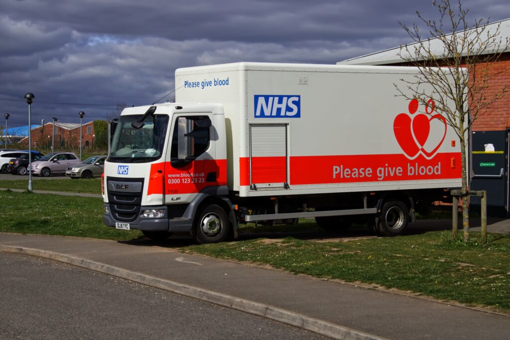


Table block
A table block is used to organise information into rows and columns, making it easier to compare data and understand relationships between values.
When not to use table blocks
Avoid using tables for long passages of text or when the information can be explained more clearly in normal paragraphs or lists. Do not use tables for layout or design purposes, they should only be used for genuine tabular data.
| Table header | Table header | Table header |
|---|---|---|
| Table row 1 | Table row 1 | Table row 1 |
| Table row 2 | Table row 2 | Table row 2 |
Audio block
An audio block lets you embed an audio file directly on a page so users can listen without needing to download it.
When not to use audio blocks
Avoid using audio blocks if the information is essential but not available in another format. Not all users can or want to listen to audio. Do not use audio for decoration or as the only way to communicate critical information.
Action link text block
An action link text block highlights a key link within normal text, guiding users to take an important next step without using a button or a box.
When not to use action link text blocks
Do not use an action link text block for minor or secondary links, as overusing them reduces their impact. If you want to direct attention to a primary task that needs to stand out strongly, use a button or action link box instead.
General enquiries block
Place the block at the end of a page or section, once users have had a chance to read the content and try to solve their problem. Keep the wording clear and supportive, for example “If you can’t find what you’re looking for, contact us.” Provide multiple contact options where possible, such as email, phone, or a web form, so users can choose what works best for them.
General enquiries
You can include an optional description here to give users extra context or guidance.
- Address:
123 Example Street,
Exampletown,
EX4 2MP- Phone number:
- 01234 567 890
- Email:
- [email protected]
YouTube Block
A YouTube block lets you embed a YouTube video directly on a page, so users can watch it without leaving the site.
When not to use YouTube blocks
Do not use a YouTube block if the video contains essential information that is not also provided in text. Not all users can or want to watch video. Avoid embedding long or unrelated videos, as they can distract from the main content.